Jacqueline Shepard Casey in studio, circa 1972
GCP-00004382


We want to hear from you
Prestigious research universities are generally not known for their progressive graphic design, unless your definition of progressive graphic design includes the obscurantist blackletter styles found on diplomas or the fussy symbolism and dead-language inscriptions that festoon university seals. There is one institution, however, that has established a truly modernist design legacy over the last half century: the Massachusetts Institute of Technology.
Midcentury America was mired in a culture of “commercial art,” typified by cluttered layouts, clichéd illustrations and decorative typefaces. At the same time, in postwar Europe designers were perfecting a new, “objective” approach to design communications, typified by minimalism, white space, abstraction, and – above all, the use of a new sans serif typeface called Neue Haas Grotesk by the foundry that created it, soon to be marketed under a new name: Helvetica. The story of how this graphic style came to the New World is not well known, and MIT is at the heart of it.

Muriel Cooper and Jacqueline Casey were talented designers who worked together at MIT’s Office of Publications; Cooper started in 1952, and recruited Casey, who joined in 1955. Together they created catalogs, calendars and posters, influenced by academic colleagues like MIT’s Gyorgy Kepes and Yale’s Paul Rand. But it was the 1959 arrival on campus of a visiting designer from Basel, Switzerland, named Thérèse Moll that introduced them to the precepts of European modernism, and planted the seeds of what would become known as “The MIT Style.”
The almost scientific rigor that Swiss designers brought to their work proved uniquely suitable to the Cambridge milieu, tempered by the Americans with a sense of playfulness and imagination. This defined the look of the Institute going forward. Casey’s startling posters, every one as bold, simple and rigorous as a painting by Ellsworth Kelly; Cooper’s epic books for MIT Press like Bauhaus and Learning from Las Vegas, each bearing on the spine her magical logo of seven vertical lines; not to mention the publications and promotions by their co-workers Ralph Coburn and Dietmar Winkler: this MIT output was, in its way, no less consequential than anything invented in Building 20.
GCP-00004382
In the late seventies, I was a design student from the Midwest interning across the Charles at WGBH. I was well aware of this astonishing legacy. To me, the output of other institutions of higher learning seemed smothered in musty Victoriana. By contrast, MIT was thrillingly, unashamedly modern. It shaped who I was to become as a designer, and loomed large in my imagination when nearly four decades later I began working for MIT myself. My first assignment was a logo for MIT Media Lab, the institution that Muriel Cooper had created 1985; I’m not sure it helped when her co-founder, Nicholas Negroponte, asked for something as timeless as her MIT Press logo. I went on to shape the identity programs of MIT Libraries, MIT Technology Review, Schwarzman College of Computing, and the MIT Alumni Association. This delirious run culminated with the invitation to provide the graphic design for the newly relocated MIT Museum.
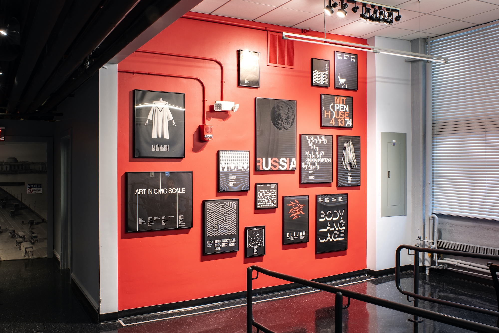
I won’t forget my first visit to the Museum in its old home, and that moment when I turned a corner to discover a miniature exhibit – really, a shrine – of posters by Jackie Casey, all black and white on a dazzling red wall.
Casey and Cooper and their colleagues used their talents to surprise and delight, to instruct and edify, to make an indelible statement on behalf of an extraordinary institution. This commitment set the standard we sought to meet with our work.

We were fortunate to find a simple trick, the meeting of MIT and MUSEUM through a shared M (in a 21st century digitized version of Neue Haas Grotesk, of course), that suggested the sense of connection that we knew the Museum would engender in its visitors. That became the starting point of a graphic approach to support the Museum building, its exhibits and its communications.
My hope is that this work both contributes to a uniquely MIT experience in every part of the Museum while honoring a legacy that we can only hope to match.